Final Project
The topic of our ebook is healthy eating. We chose to do a guide on healthy eating because it is a relevant topic for our target audience of millennials aged 24-30 years old.
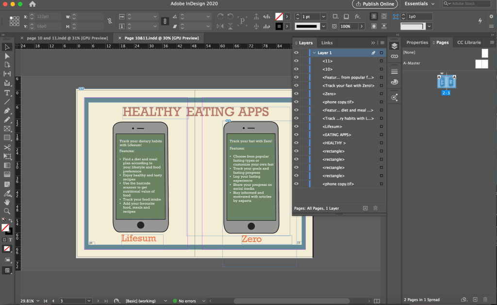
Our ebook is divided into 5 key sections and each of us was in charge of a section and supposed to do research for the content on that section. I was in charge researching for the content on mobile applications that support healthy eating. I came up with 3 apps initially and they are Lifesum, Food Stand and Ate which help users build and maintain sustainable healthy eating habits in different ways. For the idea pitch, we each came up with a rough sketch for our section.

As we did our section separately, the content had some inconsistencies. After the idea pitch, we organised our content again. Following a suggestion from a classmate that we can include some diet apps such as keto apps which were included in our diet page, my group member also suggested that I just keep 2 apps and look for apps that are relevant to the diets. Hence, I removed Food Stand and Ate which are for tracking dietary and building healthy eat habits and only kept Lifesum which offers recipes and diets including Mediterranean Diet that was included in the diet page. I thought I want to keep the app instead of replacing it with a Mediterranean Diet app because the diets have many other features and offer a variety of diet and meal plans which allows the users to have more choices. In this way, users can find better diets or diets that are more suitable for them through the app that we recommended. Another app that was included in the final content is Zero which users can use to track and document their fast. The users can find the fast that we suggested in our guide as well as customise their own fast. As our ebook has limited space, we cannot include everything thus I hope we could aid the users in discovering more ways to eat healthily if they need or want through the apps that we suggested.
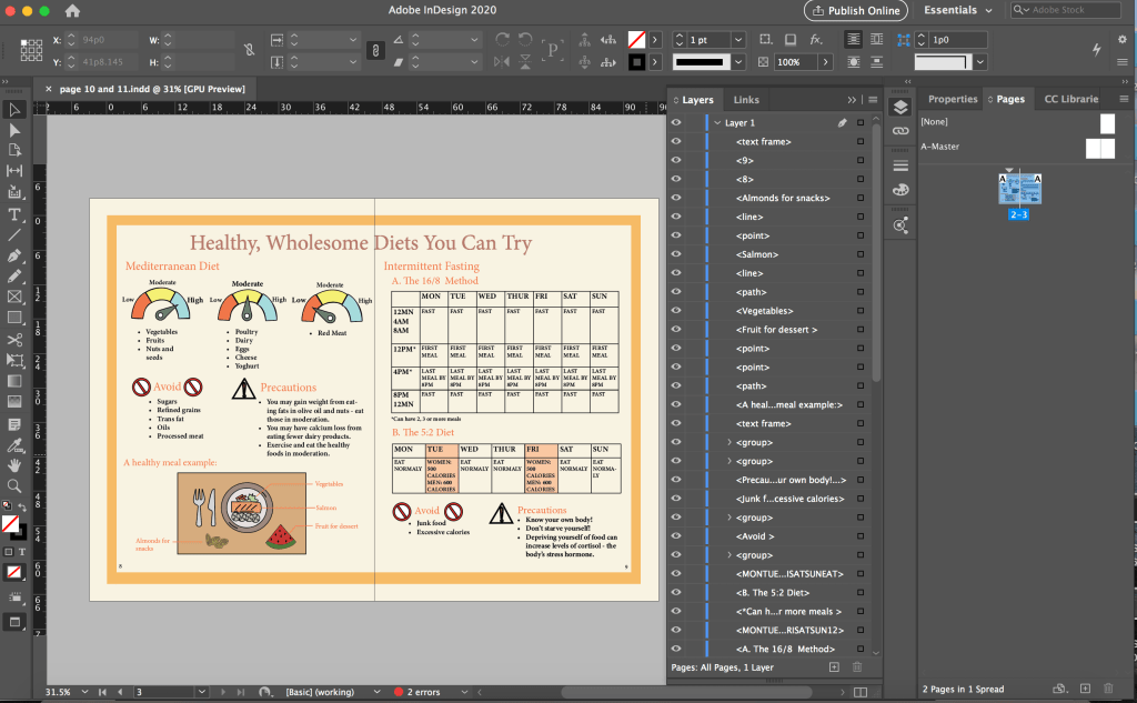
In terms of work distribution for the prototype, we had one person to do organise and condense the content to be placed in the ebook, two person to do the icons and other two to do the layout. I was in charge of the content part. One of the layout person did the sketches on paper and the other had to do the layout accordingly on InDesign which I thought was a lot of work for one person. As they did not started doing the layout very early, plus we were not very familiar with InDesign, the person in charge of doing the layout on InDesign had help from us so that we could finish the prototype faster and in time for the presentation. I helped to do the layout for the diet spread and the mobile apps which I thought could make up for the lighter workload I had compared to the others a little.

Although I just had to follow the sketch provided and put in the icons and text, I took quite a while to finish each spread as I was unfamiliar with InDesign. I first struggled with placing the icons from photoshop into InDesign as every time I shift the icon, a part of it goes hidden. I explored with it and realised that I was doing it wrongly and there was a border for me to shift the icons as a whole. I was shifting the icon within the box for the icon, that was why part of it became hidden.
Due to time constraint, I just followed the sketches and did the layout accordingly without thinking much about the layout. I had to use white colour for the text on the phones because of the green background as black would not be that readable against the dark background. I did not thought of changing the background colour or that I must use black text. However, using the white text on the dark background is not consistent with the rest of the pages in the ebook as highlighted in the feedback from the final presentation. After this, I was more cautious about using different text colours as we have to maintain a consistent look throughout the ebook.
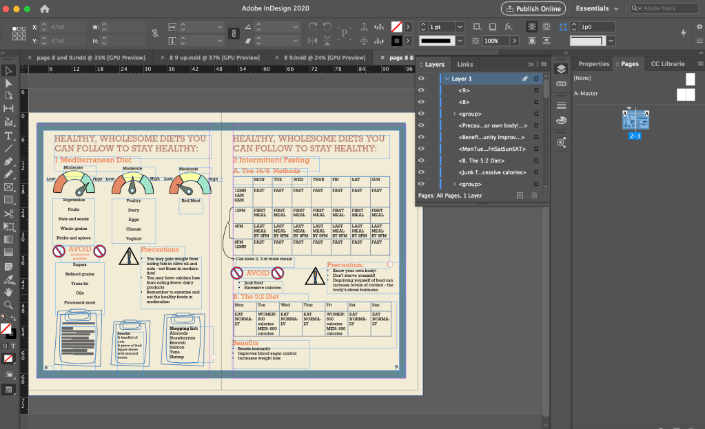
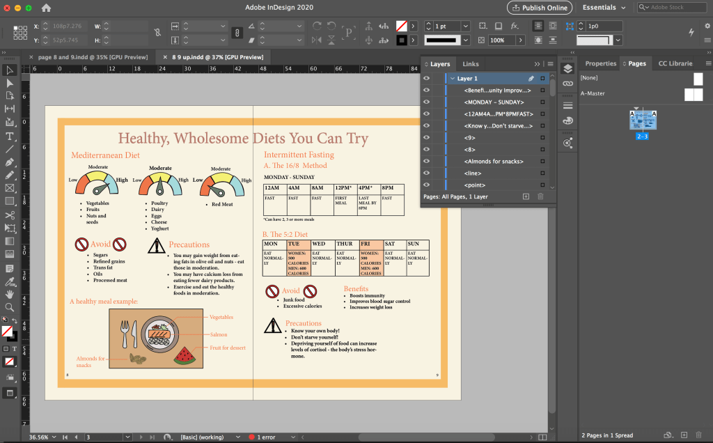
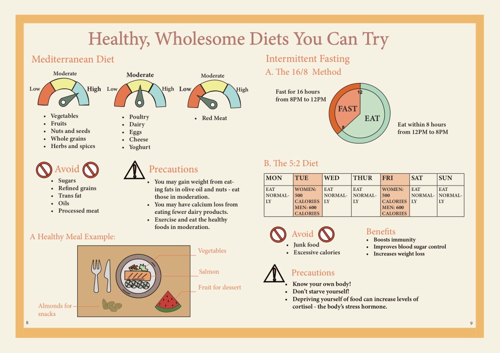
For the diet spread, there was a lot of words and we also have tables for the fasting methods but we only had very little space to fit all of these information inside, thus the words end up to be very small and there were little spacing between each elements which make it difficult for the reader to locate which information belong to each other which was a feedback we got.
After the final presentation, we made improvement according to the feedback that we got. We decided to have everybody edit the pages that they did content research for. I was supposed to work on mobile app pages but due to a miscommunication, I ended up working on the diet spread instead.
However, I had already started working on the mobile app spread and had created some icons using photoshop such as the one below as my initial idea was to have small representative icons beside each app feature. Although the icons were not used, I got to practice creating and drawing icons in photoshop and illustrator which was something I was not very good at. As I wanted the icons to be clearer and not pixelated when zoomed in, I would convert the icons into vectors in illustrator which I was not very familiar with before this as I used photoshop for my previous assignments. I learnt about image tracing in illustrator when I tried to convert the app logos into vector in illustrator. The Zero app logo was hard to convert to vector as it has a lot of colours, I spent a long time on it and still could not manage to convert it but thanks to it, I got to explore the settings quite a bit and gained new knowledge.

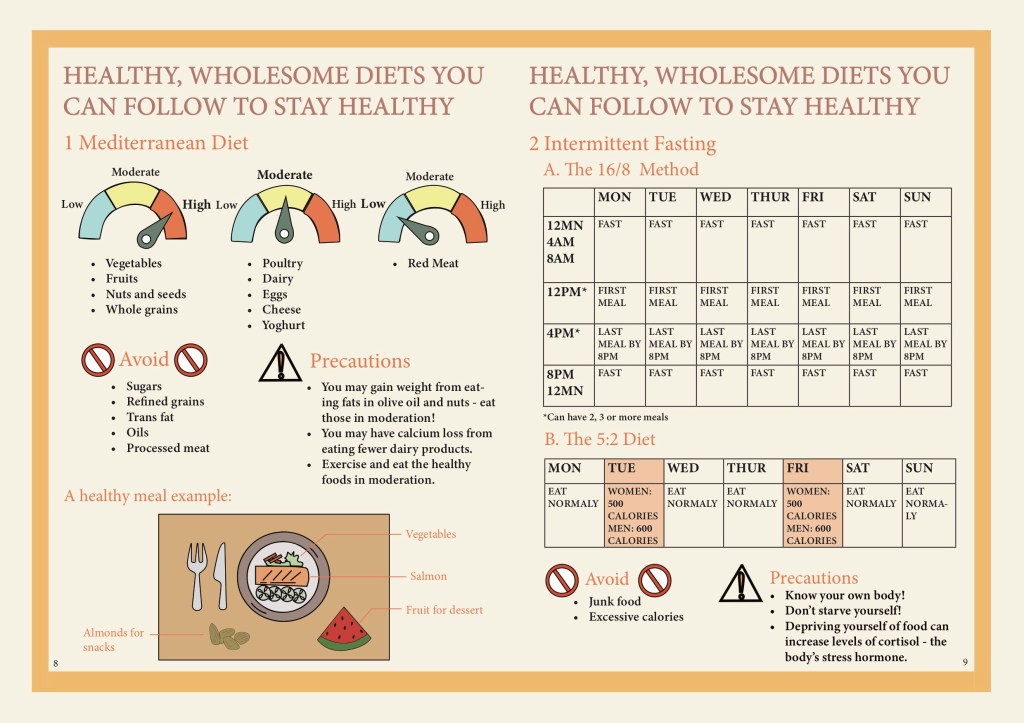
As we changed our colour scheme after the presentation, when we edit our prototype, we started afresh on a new file instead of editing in the previous file. As I typed in the text, I put in bullet points for the Mediterranean Diet section and set the text to left aligned for better readability as previously the text was centre aligned and had big spacing between each point, making it very disorganised and hard to read.
I also swapped the placement of the 5:2 diet table and the “Avoid” + “Precaution” sections so that it is clearer since those are things that the readers should take note of for both fasting methods instead of just for the 16/8 method (previously they were placed below the 16/8 method).
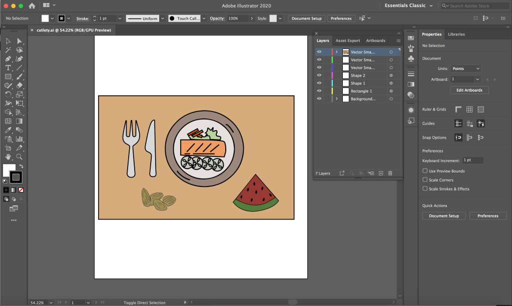
For the diet spread, a lot of the feedback was regarding the tables being unclear and hard to read and the page was very cluttered as well. I discussed with a group member who did the original sketch for the diet spread and she wanted to change the clipboards that were at the bottom of the page (the feedback was that the sketchy drawn clipboard was inconsistent with the icons in the other pages). There were a lot of words squeezed in the small clipboards as well. The other group member also suggested some ideas and we replaced the clipboards to a table setting with an example of a healthy meal.
As the plate, watermelon and almonds icons are created by another group member in Illustrator while the table and cutlery are created by me in Photoshop, I first put all the icons together in Photoshop and transfer them to Illustrator to convert all of them to vectors.
I wanted to remove the table for the 16/8 method because there were feedback saying that it was not clear and it made our page very wordy as well. After discussing with my group, I reduced the table to only 2 rows since the schedule for Monday to Friday was the same.
During the discussion, I suggested to use a clock to represent the schedule instead and the other members liked the idea but a concern was that it could make the section very empty. For a better comparison, I did another version with the clock and added a line of explanation at both sides of the circle so that it is clearer to the reader and also to fill in the empty space around the circle. I thought it was also not feasible to fit so many words in the small circle.
In the screenshot above, I had a message showing that there was 1 error. I did not notice it before that but when I did my edit 3 (below), I clicked the error message and realised I had overset text – some of the points under the first scale was being cut off. There was supposed to be 5 points but only 3 were visible. I thought the error message feature is very useful as I probably would not notice that there were only 3 points without the error message.
The version with the clock is the final layout that we decided to use as we thought it was clearer than using the table. However, after editing our own pages, we had one person to adjust the spacing between the elements in the pages so that it would be consistent throughout the pages. Hence, the above one is not the finalised version in our final prototype.
Although the clock appear to only have a two circles and few sections in it. I took a while to draw the clock because I had problem drawing the parts in the sense that they would fit perfect when combined together. As the section had different colours, I could not just draw two circles and overlay them.
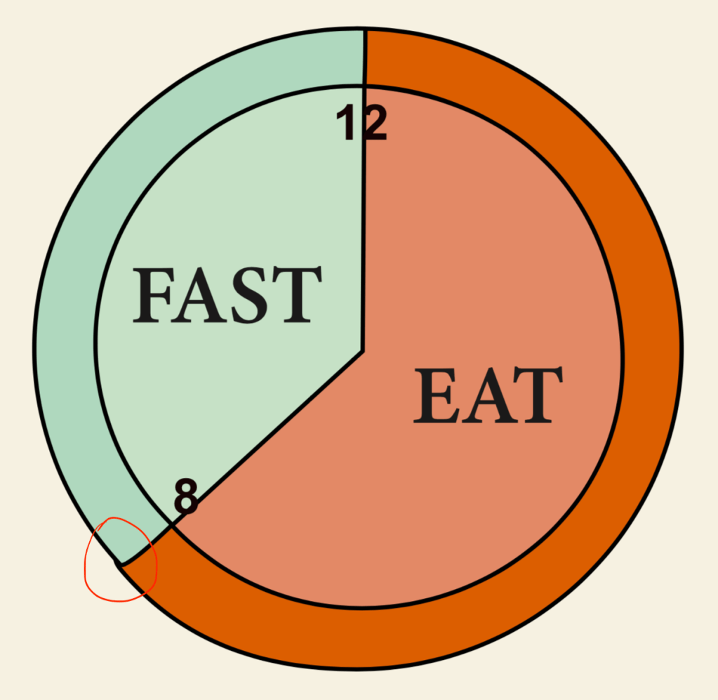

I explored different ways to draw the different parts. I tried to use the circle as an anchor and after multiple times, I managed to draw them as perfect as possible so there won’t be any gap when I put the parts together but it was still not perfect, the outer circle was sticking out (circled in red above) so I had to manually tweak it. (The photoshop version above was already fixed.) I changed the colour of the clock in InDesign so that the colours are more consistent.
Through this project, I brushed up on my skills in Photoshop, Illustrator and InDesign. I got to explore features that I did not know of before and learnt more on how to use each interface. I also learnt more about the importance of colours and layout in an ebook. In particular, what colours to use to make our ebook more visually appealing and also which colours are more suitable for our healthy eating theme. The typeface used is also important as we were going for a minimalistic look but the initial typeface we used was not suitable. I learnt that it is important to consider the platform of circulation for the book which we fail to do so when choosing a typeface.
I also learn that communication in a group is very important. As we are creating an ebook together, it is very important to communicate and coordinate with each other. We have to constantly communicate and take note of what fonts and what colour scheme the group is using when we edit the spread that we were in charge of so that we can achieve a consistent look throughout the ebook. It is also important to constantly update each other on our progress to get feedback and also so that our page layout is consistent across all pages. It is also important to communicate with each other and know which parts we were in charge of so our work do not overlap and ended up having two person working on the same spread at the same time which was what happened. We could have completed our work more efficiently if we did not do double work. Through the group project, I feel that I could also learn from the other group members and come up with new and better ideas during discussion.
Assignment 3
My infographic is on conserving water. This is a combination of chart and how to infographic but my focus is more on the how to part.

Above is my sketch for critique 1. The how to part took up most of the space because I wanted to just do a how to save water infographic but I thought I should add some statistics as an introduction to why we need to save water.
The feedback from the critique session was that I could represent the statistics in a better way. Instead of using the 1.5 litres bottle, I could use something else to do represent the 148 litres so people could get a clearer idea on how much is 148 litres. (It is 143 litres by the way, I use the wrong number in this sketch.) The same goes for the 430 million figures as well.
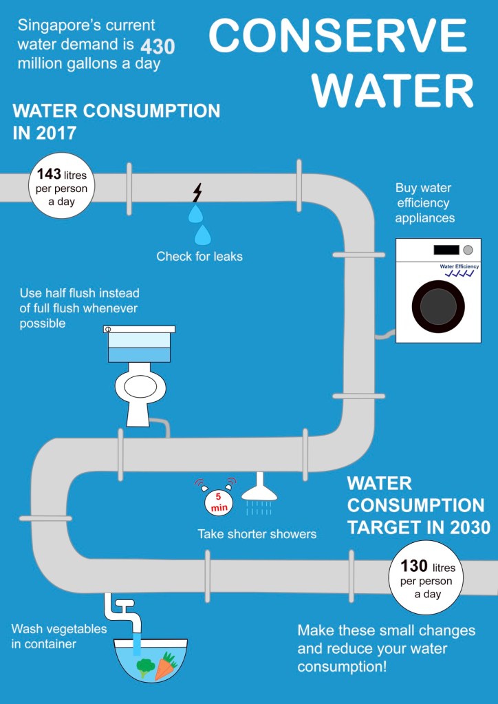
After much thought, I still wasn’t sure of how to better represent the statistics so I decided to just use words and use a bigger font for the numbers to emphasise it. I also changed the layout because I felt that the layout for my sketch was too simple and I wanted to make it more visually appealing. Hence, I use a water pipe to symbolise a timeline, but instead of time, I placed the water saving tips along the pipe. At the start and end of the pipe, I use two circles to represent a water meter with the water usage in it. What I wanted to convey through this is that if you follow these few steps, you would be able to reduce your water consumption per day from 143 litres to 130 litres by 2030.
The feedback for this was that the pipe was taking up a lot of space in my infographic and I could reduce its prominence and expand on the visual representations for the numeral statistics. Also, my background colour could be too saturated.
After the feedback, I decided to just remove the water pipe and use the original layout that I had in my initial sketch. The top part shows the figures and the part below shows how to conserve water. I represented the 430 million gallon of water with gallon icons because I thought that would be the easiest to understand for the audience. Initially, I wanted to represent it with swimming pools but I felt that that would be too much and its hard for the audience to imagine how big exactly is the swimming pool I’m talking about (at least for me). For the individual water consumption, I thought a lot about how to convey the message that the aim was to reduce this much of water consumption from 2017 to 2030 without using too much words. I decided to just use a bar graph to represent the water difference between 2017 and 2030 and use “Individual water consumption a day” as the heading. I wanted to write “Singapore aims to reduce individual water consumption a day from 2017 to 2030” but that was too wordy and left little space for any other graphics or charts.
I explored the colours that I could use for the background and decided to use a dark shade of blue to show more contrast between the white and blue colours used in the foreground. I wanted to use a bright colour background like the one in my critique 2 because I’m scared that using a dark colour would make the infographic looks dark but guess bright colours were not too desirable because of the shade of blue that i use for my graphics. I played around with the shade of blue and thought this shows the best contrast.
This assignment was the toughest for me among all the 3 assignments but I also learnt a lot while doing this assignment. I learnt how to visually represent numeral statistics and also the importance of colours as well as typography. I use the same typeface throughout to maintain consistency and only bold the title and heading for a greater emphasis. I also used a bigger font to emphasise on the numbers. How represent each of the conserving water saving tips was also a problem for me as I am not a very creative person. Hence, I tried to represent them in the simplest way that I could. Overall, I felt that I have learnt quite a lot doing this assignment and could bring forward what I have learn to whatever tasks I might be assigned to in the future, although my current work still needs a lot of improvement.
Assignment 2
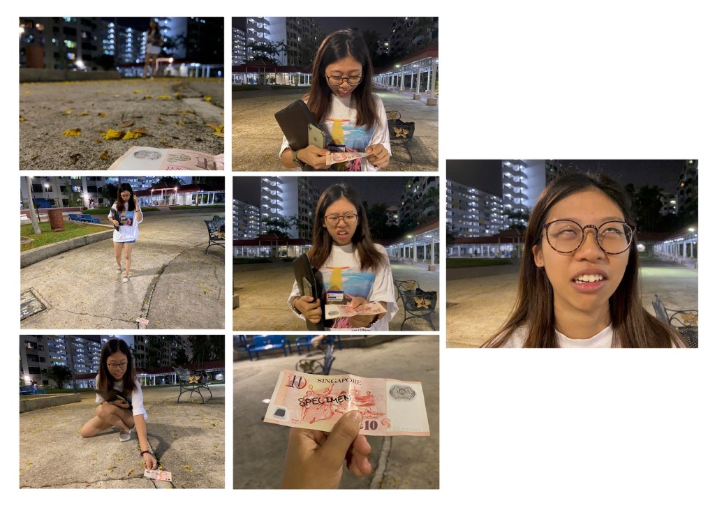
This is a story about a girl who found a $10 note on the floor and was happy about it but it turned out to be a specimen note, adding a plot twist at the end. Above is my critique submission. For the establishing shot, I used a wide shot and I took the photo from a low angle to show both the $10 note in the foreground and the girl in the background walking. The second and third shots are also wide shot to show the girl spotting the money on the floor and picking up the money. In the fourth and fifth shot, I used medium close up shot so that both the girl’s expression and her upper body, mainly because I want to capture her hand holding the note. The sixth shot is a close up shot of the note to show and emphasise that that is a specimen note which explains her expression change. The last shot is a close up shot of her expression which is the key focus here as she is annoyed after finding out that that was a specimen note. I chose to use a close up shot rather than a medium close up shot because there is no need to show her holding the money again and also, I thought it would have a funnier effect to close up on her rolling her eyes.
During the critique session, I was told that my layout is not clear as people usually read from left to right. I chose to arrange the photos like that because I have 7 photos which is an odd number and I could not arrange them in 3×3 and 4×4 manner. I also wanted to emphasise on the last photo so I placed it individually on the right side and made it a little bigger than the rest of the photos.
Another feedback was that the girl is not obvious in my establishing shot as she has blended in with the buildings at the back.
I was also told that the shot of the “specimen” note was not convincing as the word “specimen” was handwritten. A suggestion was to print a real specimen note.
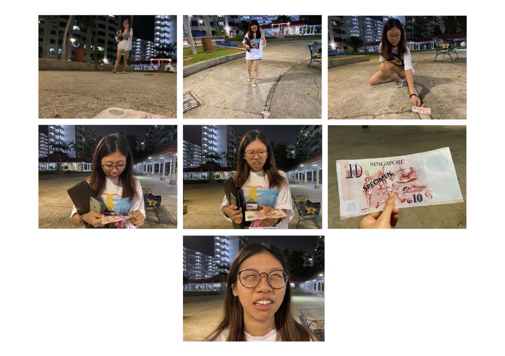
After the critique session, I made some changes to my work. Firstly, I changed two of the shots. I retook the establishing shot. Initially, I took the shot from the same angle which is from the front but I felt that the girl was still not very obvious. Hence, I tried to take the shot from the side instead and it was a better shot as the girl could be seen much clearer. I also printed out a real specimen note and took a tighter shot of it from the top as I felt that the shot in my critique submission was not tight enough as a lot of the background including the chairs can still be seen. The shot also looked very flat and unnatural so I took it from a higher angle to have more of the “in your face” feel.
Finally, I changed the layout of the photos. The order is now left to right but I placed the last photo in the center. I originally placed it at the most left side but it felt very empty on the right and looked like there was supposed to be more to the story.
I thought a lot about the layout and was thinking if I should make it 8 or 9 photos instead so it could make it 3×3 but I thought I decided that those 7 photos are enough as I did not want to drag the story by putting in extra shots just so the layout could be nicer.

One of the photos that I wanted to add was a photo of a medium close up shot of her expression when she discover the note on the floor but I did not include it in the end as I felt that it did not make such a big different to the story and to the layout.
I also took portrait shots of her picking up the note as I felt that a landscape shot would be too wide as the background is not important in this photo. However, I still decided to use the landscape shot as it fits in better with my layout and the orientation is more consistent with that of my other photos.
Through this assignment, I learnt how planning could be useful. I took the photos according to my storyboard and that saved me a lot of time as I knew exactly what shot I want. However, I also explored with other shots that were not planned when I was taking the photos and learnt the importance of the different shots. For example, a medium close up shot and a close up shot of the same thing could evoke different feelings and convey different idea. My last photo would be less funnier if I used a medium close up shot instead of a close up shot as there would be less emphasis on her face as the shot is wider.
Ex. G
Assignment 1
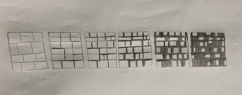
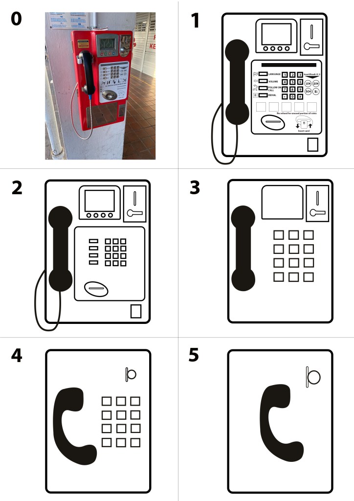
In this abstraction assignment, I have chosen a payphone as my object.

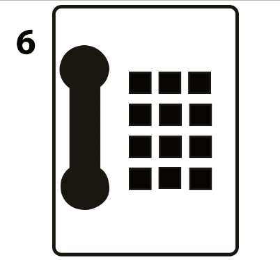
In stage 2, I tried to replicate the salient features of the payphone in the original image such as the handset, keypad and coin slot. Then, in stage 3 I removed the numbers on the keypad, the coin return slot as well as the inner screen and the buttons under it. In stage 4, I removed the side buttons and the card slot. In stage 5, I removed the coin slot and made the screen bigger. I also removed the outline of the keypad and made the keypad bigger. Finally, in stage 6, I removed the screen and move the keypad up to the center. In this last stage, I filled the keypad with black colour as I feel that this would make the keypad stand out beside the black coloured handset. My intention was to draw the audience’s attention to these two features. I chose to only include the handset and keypad as those two are well recognised feature of a payphone. I chose to keep the phone cable throughout all the stages to help identify my handset as a handset because I feel that the handset in my final stage does not look like a handset without the cable because of its shape. I thought it looked more like a bathroom safety bar than a handset.
The above image is my final stage without the phone cable. I tried to replicate the original shape of the handset as closely as possible in all my stages.
In the abstraction process, my thought process was to remove features that I think are less or not important.
During the critique session, the first feedback I got was that my final stage looks like a house phone rather than a payphone which was what I intended it to be. This was a good point as I also had the thought that it looks somewhat like a house phone but I was not too sure of how to make it look more like a payphone. Initially, I wanted to retain the coin slot as it is a prominent feature of a payphone, but the coin slot looks out of place if I just kept only the coin slot at its original spot without the coin return lever at the final stage. Hence, after much consideration, I decided to exclude it. I did not keep the coin return lever because I thought it would be too much details for this abstraction assignment.
I talked about my concern in response to the feedback and a feedback I got was that I could place the coin return slot somewhere else or represent it with a symbol. A general feedback was that I was following too closely the original placement and shape of the parts of the payphone. I placed everything at the same spot except for the keypad and kept the handset shape throughout the stages because I thought everything had to be at the same place and same shape. I resized the keypad and shifted its position as only the keypad and handset remain at the final stage, so I thought the keypad size had to be bigger and centralised so that it stands out at the final stage.
After the critique session, I tried to improve my work according to the feedback and above is my final submission.
At the critique session, I was also told that my stage 1 could be too abstract so in stage 1 of my final submission, I added in more details like the words and symbols. I did not include it for the critique submission because I did not think that was necessarily as I thought I just had to capture the main features of the payphone. In stage 2, I started by taking away all the words and symbols. In stage 3, I decided to remove parts that I did not think were that important for identifying a payphone. Hence, I took away the inner screen and the buttons below it, the buttons beside the keypad, the frame for the keypad, the coin return slot and the phone cable. This is similar to my stage 4 in the critique submission but I removed the phone cable because I do not think that it is important as I was going to change the shape of the handset to a more easily identifiable one. In stage 4, I removed the screen and the coin return lever and added a circle to represent a coin at the coin slot so that it can be easily identified that that is a coin slot. I also changed the shape of the handset because I thought the original handset that I drew does not quite resemble a handset and would not be identifiable at the final stage. I then shifted the keypad to the right to make space for the handset. In stage 5, I thought I could push it further and removed the keypad. I thought just the handset and the coin slot would be enough to identify the object as a payphone.
In this assignment, I learnt how to simplify a complicated object. I learnt that I do not have to replicate each feature but instead, represent it with an easily identifiable symbol. This was an important learning point to me as I never thought of doing that before the assignment. In addition, I also think that choosing a clear and correct symbol is important to convey my intended message to the audience. I also learnt the usefulness of abstraction and why there is a need for abstraction. Although abstract symbols are all around us such as the no smoking sign, I never gave much thought about it. Now that I have done an abstraction of an object myself, I know how to better appreciate abstraction and how it can be useful. Instead of drawing a payphone with so much details as in my stage 1, I could just draw a handset and a coin slot and people will still understand that this is a payphone. This is a lot more efficient, especially if I was tasked to create a public sign.
Ex. F
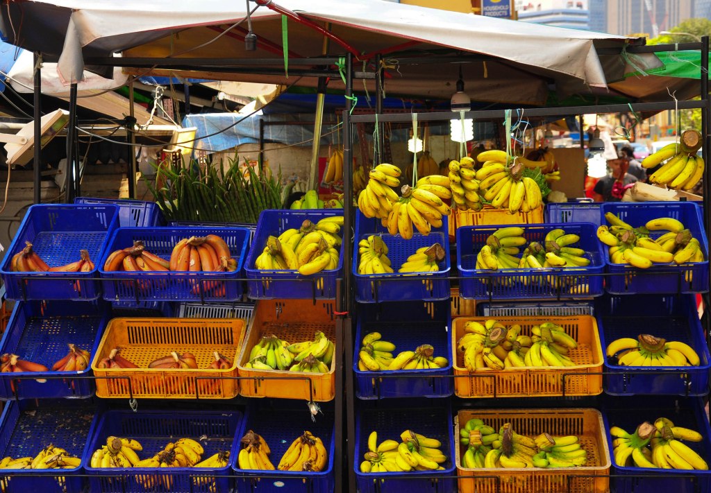
The five hues that I picked out from this picture are blue, yellow, orange, black and green. I’m not sure if this set up is intentional but this whole scene itself is very striking and it attracted my attention when I walked passed it. The bright yellow and slightly green bananas and the blue basket contrast each other and creates a vibrant look. While the yellow colour of the banana and the orange colour of the basket have low contrast, they look very pleasing together. Among the four colours, the black of the stand kind of blend in and does not destroy the overall vibrant look. The colours used here is very attention grabbing.
Ex. E
At first glance, the title is very eye catching and readable as it has a thick outline and the font is bigger than that of the body text. The body text on the other hand, is difficult to read especially on a white background. Instead of serif, the body text should use san serif as the text would look cleaner and easier to read. In addition, it would be better to fill the text with black colour so that it could be easier to read against a white background.
In addition, the body paragraph is center-aligned and the starting point of each line of words is not consistent which makes it hard to read. To improve, It should be left-aligned so that the reader can follow through from line to line easily.
The spacing between the words “TEMPOR.NUNC” in the sixth line is off and the two words are sticking together. The kerning should be increased to make the two words more distinguished.
Ex. D
For this exercise, I chose a soft toy as my subject and took 4 different shots of it.
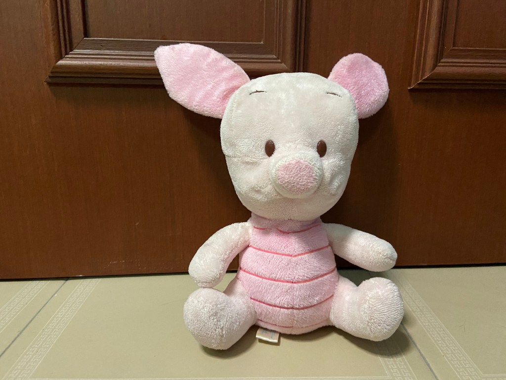
I took this photo at the eye level so that the photo looks natural to the audience, as if the audience is looking at the soft toy. I also placed the piglet slightly to the right as I wanted to make use of the rule of third for a better composition so that it would not be a boring shot with the piglet right in the middle.
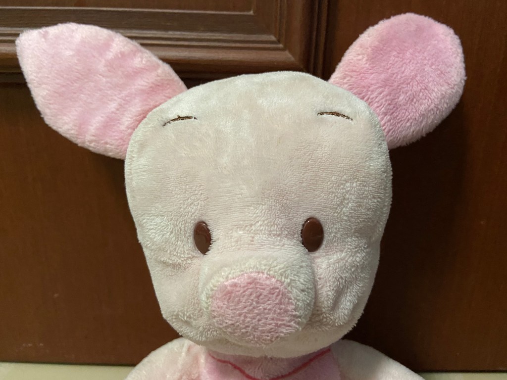
The second shot is a close up shot of the piglet’s face to capture it’s expression.
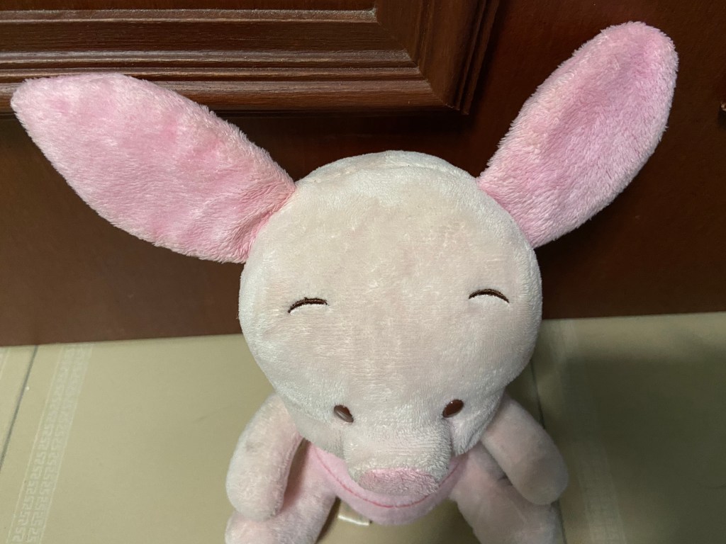
I took the third shot at a high angle to make the piglet looks small and powerless.
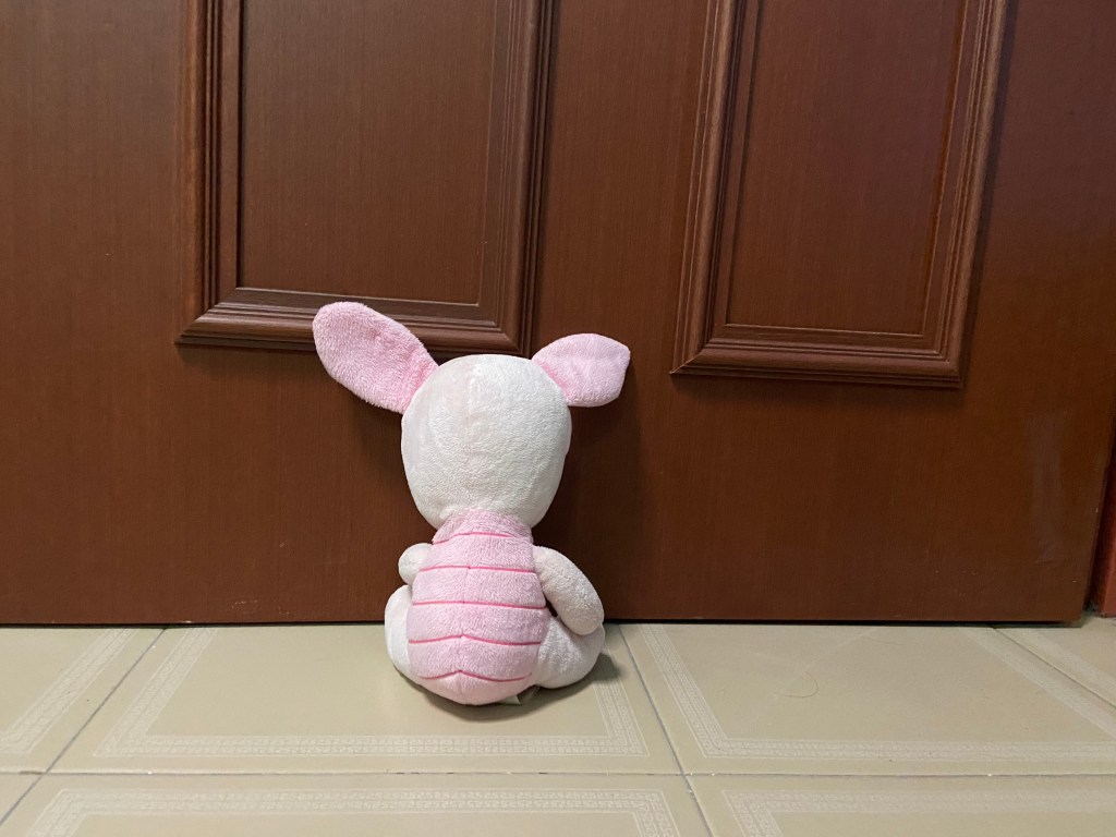
The last shot is a wide angle shot. I took this at a wide angle to show the empty surrounding as the piglet faces the wall so that the piglet appears to be lonely with no one around it.
Ex. C
The signifier here is the ketchup bottle made of tomato slices and the signified here is the message that the tomato ketchup from Heinz is made up of 100% real tomatoes with no artificial flavours. This advertisement is trying to say that every drop of the ketchup in the bottle is made from real tomatoes as seen from the bottle of Ketchup represented with tomato slices all the way from top to bottom. Slice the Ketchup bottle open from any part and you will still find real tomatoes in there. This also implies that their tomato ketchup taste just like real tomatoes.
The line “No one grows Ketchup like Heinz.” implies that Heinz is the only one with Ketchup that are made of 100% real tomatoes without any artificial flavours. Also, the word “grows” is used. One cannot grow Ketchup, one can only grow tomatoes and the metaphor used here further emphasises the naturalness of their Ketchup. It is as though they really “grow” their Ketchup.
