My infographic is on conserving water. This is a combination of chart and how to infographic but my focus is more on the how to part.

Above is my sketch for critique 1. The how to part took up most of the space because I wanted to just do a how to save water infographic but I thought I should add some statistics as an introduction to why we need to save water.
The feedback from the critique session was that I could represent the statistics in a better way. Instead of using the 1.5 litres bottle, I could use something else to do represent the 148 litres so people could get a clearer idea on how much is 148 litres. (It is 143 litres by the way, I use the wrong number in this sketch.) The same goes for the 430 million figures as well.
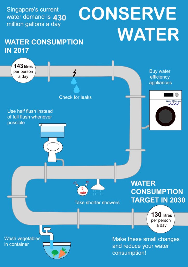
After much thought, I still wasn’t sure of how to better represent the statistics so I decided to just use words and use a bigger font for the numbers to emphasise it. I also changed the layout because I felt that the layout for my sketch was too simple and I wanted to make it more visually appealing. Hence, I use a water pipe to symbolise a timeline, but instead of time, I placed the water saving tips along the pipe. At the start and end of the pipe, I use two circles to represent a water meter with the water usage in it. What I wanted to convey through this is that if you follow these few steps, you would be able to reduce your water consumption per day from 143 litres to 130 litres by 2030.
The feedback for this was that the pipe was taking up a lot of space in my infographic and I could reduce its prominence and expand on the visual representations for the numeral statistics. Also, my background colour could be too saturated.
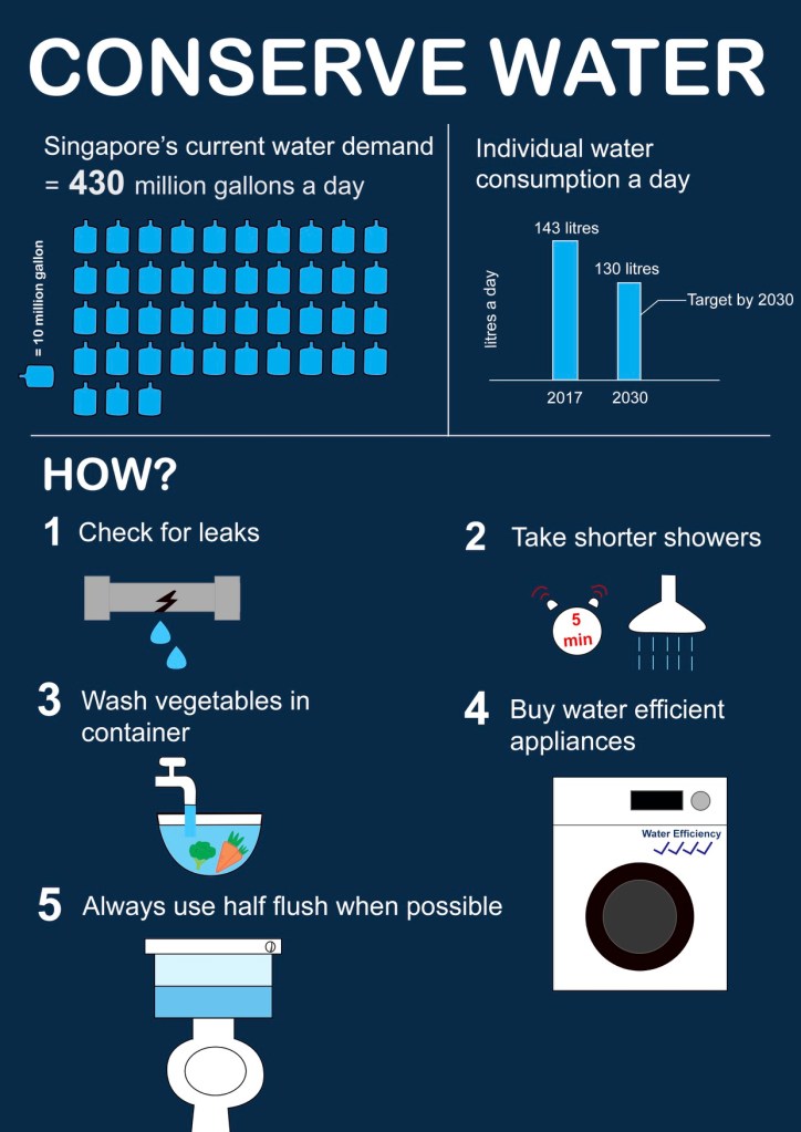
After the feedback, I decided to just remove the water pipe and use the original layout that I had in my initial sketch. The top part shows the figures and the part below shows how to conserve water. I represented the 430 million gallon of water with gallon icons because I thought that would be the easiest to understand for the audience. Initially, I wanted to represent it with swimming pools but I felt that that would be too much and its hard for the audience to imagine how big exactly is the swimming pool I’m talking about (at least for me). For the individual water consumption, I thought a lot about how to convey the message that the aim was to reduce this much of water consumption from 2017 to 2030 without using too much words. I decided to just use a bar graph to represent the water difference between 2017 and 2030 and use “Individual water consumption a day” as the heading. I wanted to write “Singapore aims to reduce individual water consumption a day from 2017 to 2030” but that was too wordy and left little space for any other graphics or charts.
I explored the colours that I could use for the background and decided to use a dark shade of blue to show more contrast between the white and blue colours used in the foreground. I wanted to use a bright colour background like the one in my critique 2 because I’m scared that using a dark colour would make the infographic looks dark but guess bright colours were not too desirable because of the shade of blue that i use for my graphics. I played around with the shade of blue and thought this shows the best contrast.
This assignment was the toughest for me among all the 3 assignments but I also learnt a lot while doing this assignment. I learnt how to visually represent numeral statistics and also the importance of colours as well as typography. I use the same typeface throughout to maintain consistency and only bold the title and heading for a greater emphasis. I also used a bigger font to emphasise on the numbers. How represent each of the conserving water saving tips was also a problem for me as I am not a very creative person. Hence, I tried to represent them in the simplest way that I could. Overall, I felt that I have learnt quite a lot doing this assignment and could bring forward what I have learn to whatever tasks I might be assigned to in the future, although my current work still needs a lot of improvement.
