The topic of our ebook is healthy eating. We chose to do a guide on healthy eating because it is a relevant topic for our target audience of millennials aged 24-30 years old.
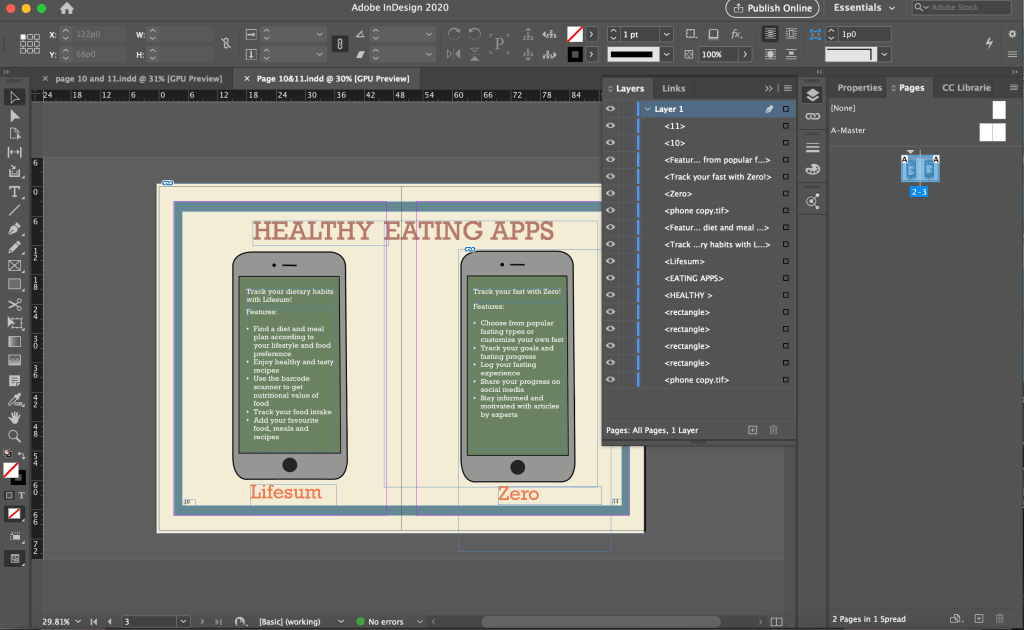
Our ebook is divided into 5 key sections and each of us was in charge of a section and supposed to do research for the content on that section. I was in charge researching for the content on mobile applications that support healthy eating. I came up with 3 apps initially and they are Lifesum, Food Stand and Ate which help users build and maintain sustainable healthy eating habits in different ways. For the idea pitch, we each came up with a rough sketch for our section.

As we did our section separately, the content had some inconsistencies. After the idea pitch, we organised our content again. Following a suggestion from a classmate that we can include some diet apps such as keto apps which were included in our diet page, my group member also suggested that I just keep 2 apps and look for apps that are relevant to the diets. Hence, I removed Food Stand and Ate which are for tracking dietary and building healthy eat habits and only kept Lifesum which offers recipes and diets including Mediterranean Diet that was included in the diet page. I thought I want to keep the app instead of replacing it with a Mediterranean Diet app because the diets have many other features and offer a variety of diet and meal plans which allows the users to have more choices. In this way, users can find better diets or diets that are more suitable for them through the app that we recommended. Another app that was included in the final content is Zero which users can use to track and document their fast. The users can find the fast that we suggested in our guide as well as customise their own fast. As our ebook has limited space, we cannot include everything thus I hope we could aid the users in discovering more ways to eat healthily if they need or want through the apps that we suggested.
In terms of work distribution for the prototype, we had one person to do organise and condense the content to be placed in the ebook, two person to do the icons and other two to do the layout. I was in charge of the content part. One of the layout person did the sketches on paper and the other had to do the layout accordingly on InDesign which I thought was a lot of work for one person. As they did not started doing the layout very early, plus we were not very familiar with InDesign, the person in charge of doing the layout on InDesign had help from us so that we could finish the prototype faster and in time for the presentation. I helped to do the layout for the diet spread and the mobile apps which I thought could make up for the lighter workload I had compared to the others a little.

Although I just had to follow the sketch provided and put in the icons and text, I took quite a while to finish each spread as I was unfamiliar with InDesign. I first struggled with placing the icons from photoshop into InDesign as every time I shift the icon, a part of it goes hidden. I explored with it and realised that I was doing it wrongly and there was a border for me to shift the icons as a whole. I was shifting the icon within the box for the icon, that was why part of it became hidden.
Due to time constraint, I just followed the sketches and did the layout accordingly without thinking much about the layout. I had to use white colour for the text on the phones because of the green background as black would not be that readable against the dark background. I did not thought of changing the background colour or that I must use black text. However, using the white text on the dark background is not consistent with the rest of the pages in the ebook as highlighted in the feedback from the final presentation. After this, I was more cautious about using different text colours as we have to maintain a consistent look throughout the ebook.
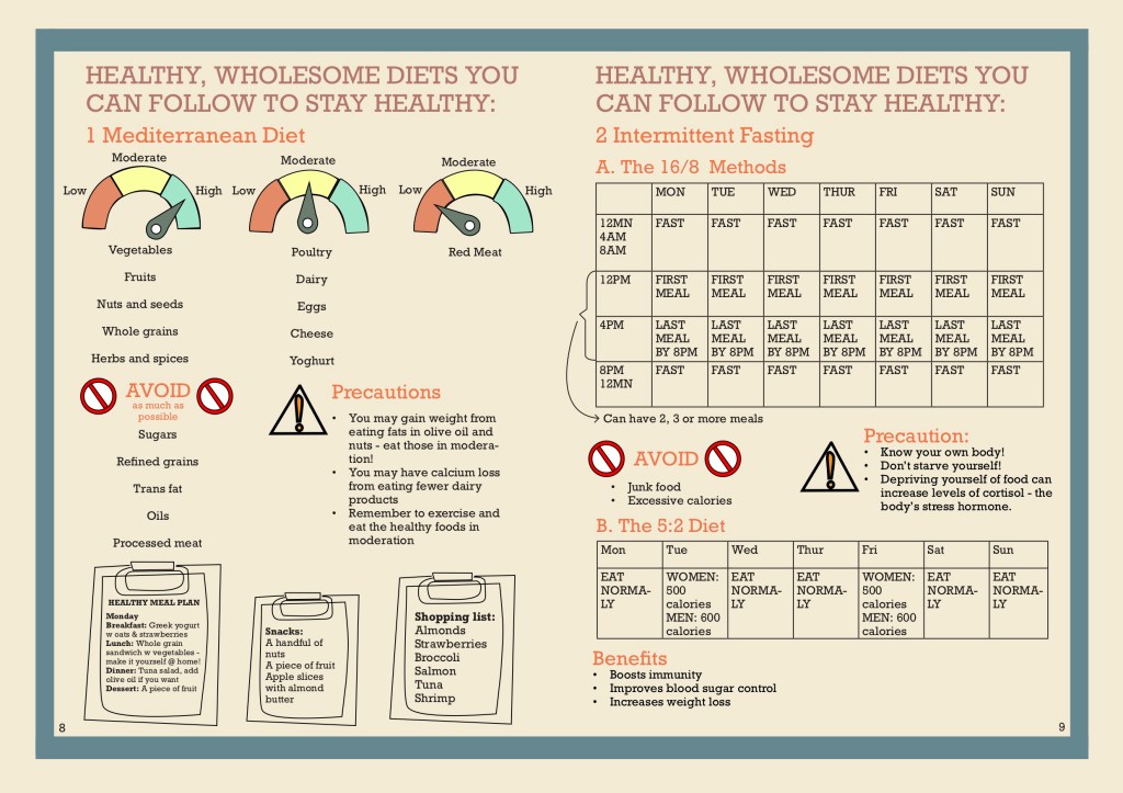
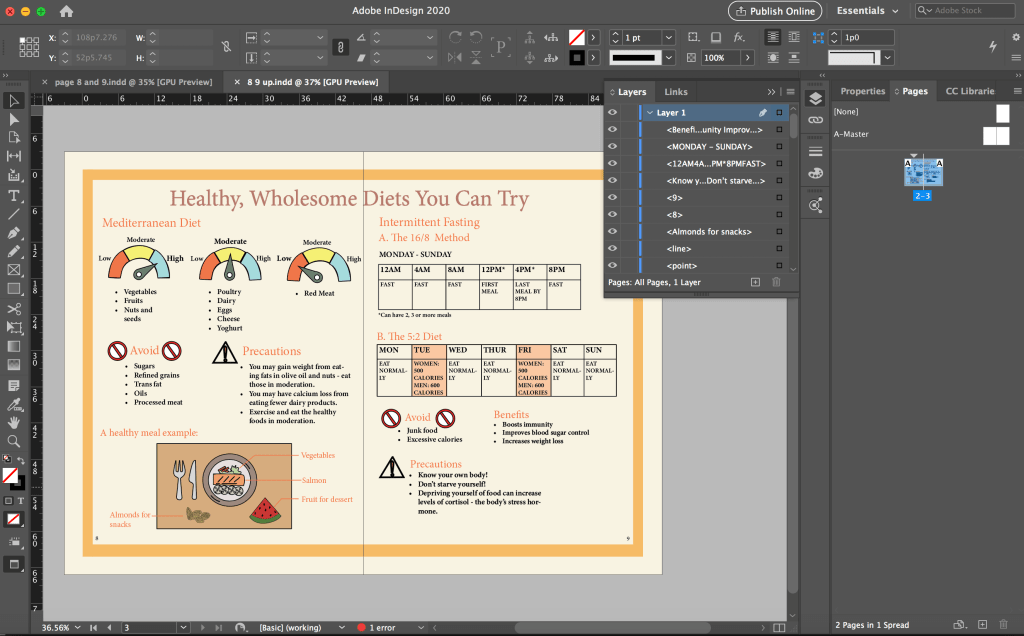
For the diet spread, there was a lot of words and we also have tables for the fasting methods but we only had very little space to fit all of these information inside, thus the words end up to be very small and there were little spacing between each elements which make it difficult for the reader to locate which information belong to each other which was a feedback we got.
After the final presentation, we made improvement according to the feedback that we got. We decided to have everybody edit the pages that they did content research for. I was supposed to work on mobile app pages but due to a miscommunication, I ended up working on the diet spread instead.
However, I had already started working on the mobile app spread and had created some icons using photoshop such as the one below as my initial idea was to have small representative icons beside each app feature. Although the icons were not used, I got to practice creating and drawing icons in photoshop and illustrator which was something I was not very good at. As I wanted the icons to be clearer and not pixelated when zoomed in, I would convert the icons into vectors in illustrator which I was not very familiar with before this as I used photoshop for my previous assignments. I learnt about image tracing in illustrator when I tried to convert the app logos into vector in illustrator. The Zero app logo was hard to convert to vector as it has a lot of colours, I spent a long time on it and still could not manage to convert it but thanks to it, I got to explore the settings quite a bit and gained new knowledge.

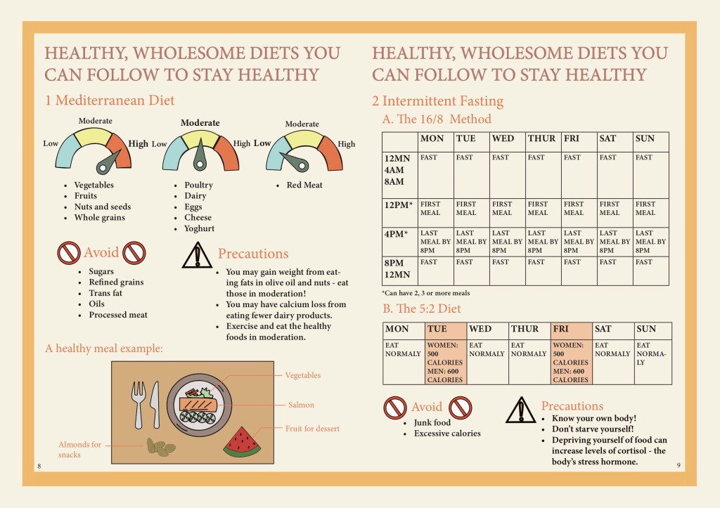
As we changed our colour scheme after the presentation, when we edit our prototype, we started afresh on a new file instead of editing in the previous file. As I typed in the text, I put in bullet points for the Mediterranean Diet section and set the text to left aligned for better readability as previously the text was centre aligned and had big spacing between each point, making it very disorganised and hard to read.
I also swapped the placement of the 5:2 diet table and the “Avoid” + “Precaution” sections so that it is clearer since those are things that the readers should take note of for both fasting methods instead of just for the 16/8 method (previously they were placed below the 16/8 method).
For the diet spread, a lot of the feedback was regarding the tables being unclear and hard to read and the page was very cluttered as well. I discussed with a group member who did the original sketch for the diet spread and she wanted to change the clipboards that were at the bottom of the page (the feedback was that the sketchy drawn clipboard was inconsistent with the icons in the other pages). There were a lot of words squeezed in the small clipboards as well. The other group member also suggested some ideas and we replaced the clipboards to a table setting with an example of a healthy meal.
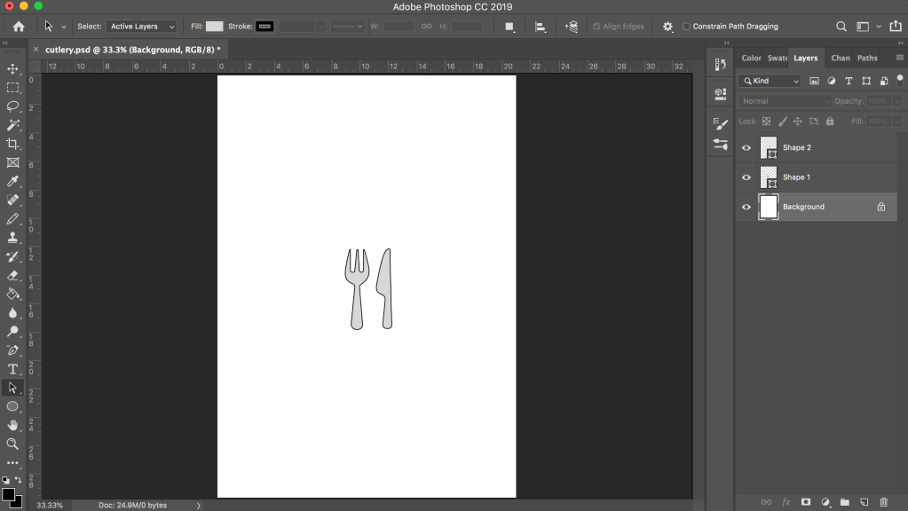
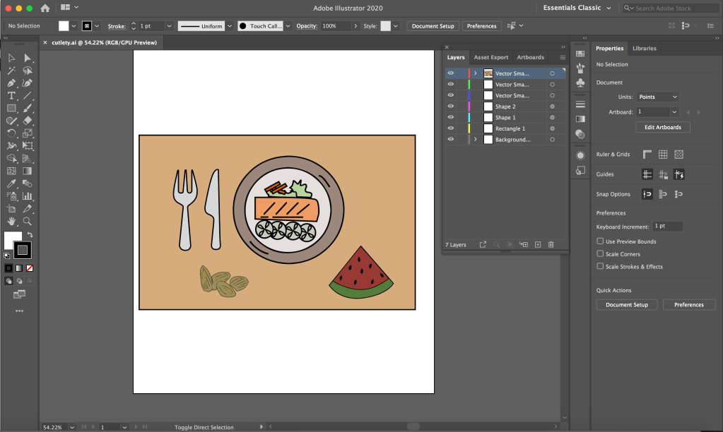
As the plate, watermelon and almonds icons are created by another group member in Illustrator while the table and cutlery are created by me in Photoshop, I first put all the icons together in Photoshop and transfer them to Illustrator to convert all of them to vectors.
I wanted to remove the table for the 16/8 method because there were feedback saying that it was not clear and it made our page very wordy as well. After discussing with my group, I reduced the table to only 2 rows since the schedule for Monday to Friday was the same.
During the discussion, I suggested to use a clock to represent the schedule instead and the other members liked the idea but a concern was that it could make the section very empty. For a better comparison, I did another version with the clock and added a line of explanation at both sides of the circle so that it is clearer to the reader and also to fill in the empty space around the circle. I thought it was also not feasible to fit so many words in the small circle.
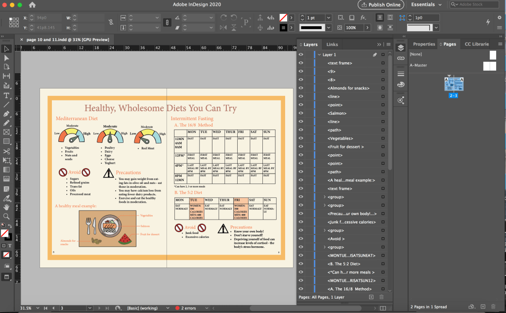
In the screenshot above, I had a message showing that there was 1 error. I did not notice it before that but when I did my edit 3 (below), I clicked the error message and realised I had overset text – some of the points under the first scale was being cut off. There was supposed to be 5 points but only 3 were visible. I thought the error message feature is very useful as I probably would not notice that there were only 3 points without the error message.
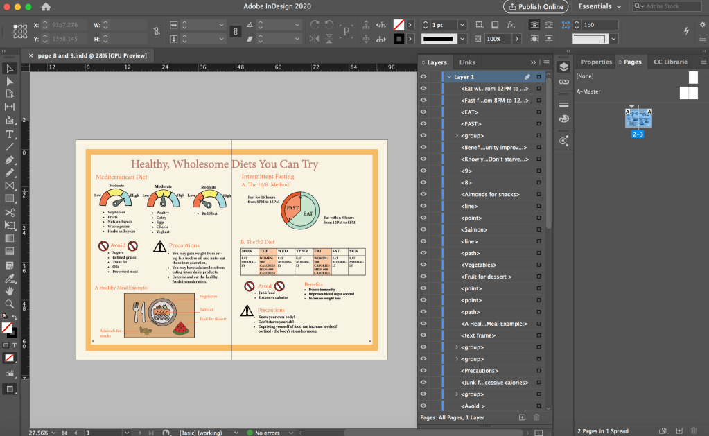
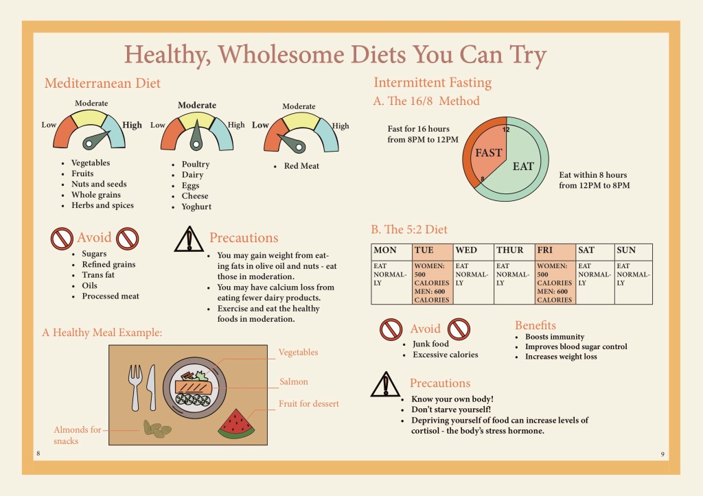
The version with the clock is the final layout that we decided to use as we thought it was clearer than using the table. However, after editing our own pages, we had one person to adjust the spacing between the elements in the pages so that it would be consistent throughout the pages. Hence, the above one is not the finalised version in our final prototype.
Although the clock appear to only have a two circles and few sections in it. I took a while to draw the clock because I had problem drawing the parts in the sense that they would fit perfect when combined together. As the section had different colours, I could not just draw two circles and overlay them.
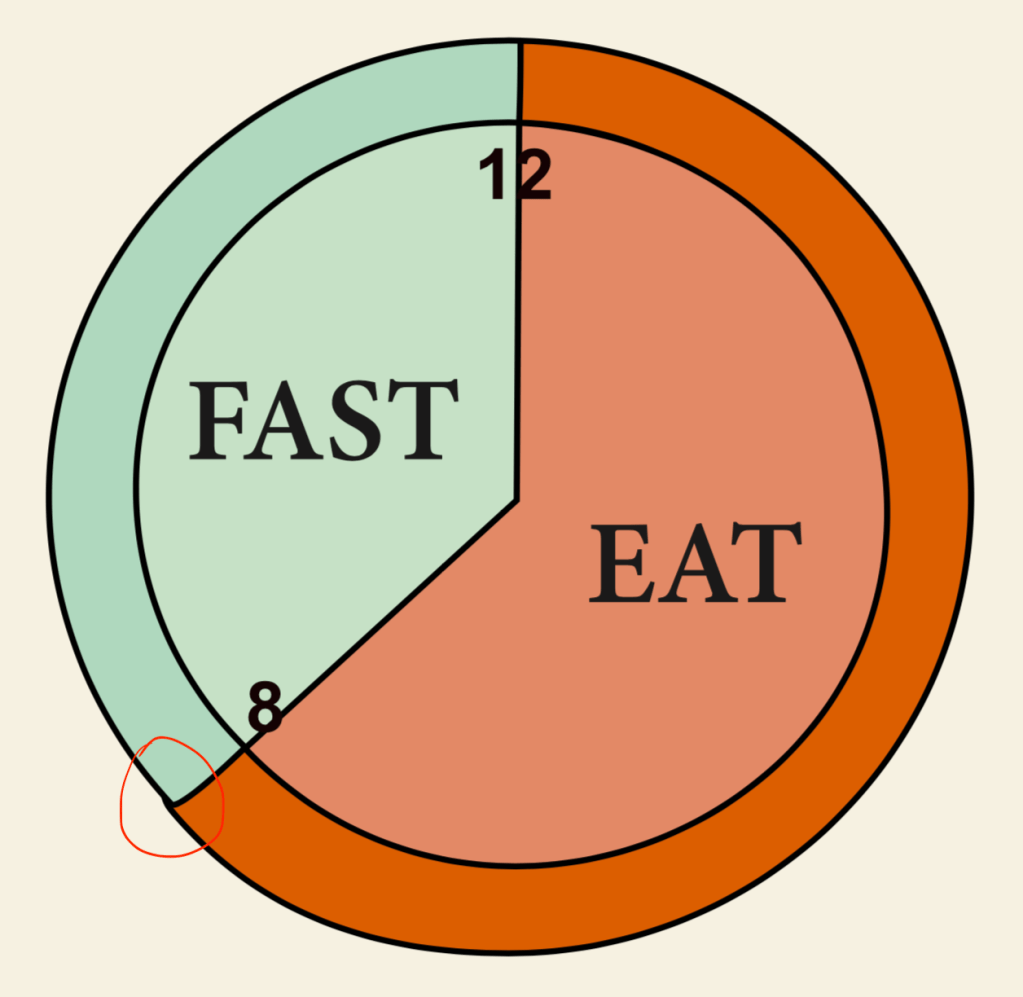

I explored different ways to draw the different parts. I tried to use the circle as an anchor and after multiple times, I managed to draw them as perfect as possible so there won’t be any gap when I put the parts together but it was still not perfect, the outer circle was sticking out (circled in red above) so I had to manually tweak it. (The photoshop version above was already fixed.) I changed the colour of the clock in InDesign so that the colours are more consistent.
Through this project, I brushed up on my skills in Photoshop, Illustrator and InDesign. I got to explore features that I did not know of before and learnt more on how to use each interface. I also learnt more about the importance of colours and layout in an ebook. In particular, what colours to use to make our ebook more visually appealing and also which colours are more suitable for our healthy eating theme. The typeface used is also important as we were going for a minimalistic look but the initial typeface we used was not suitable. I learnt that it is important to consider the platform of circulation for the book which we fail to do so when choosing a typeface.
I also learn that communication in a group is very important. As we are creating an ebook together, it is very important to communicate and coordinate with each other. We have to constantly communicate and take note of what fonts and what colour scheme the group is using when we edit the spread that we were in charge of so that we can achieve a consistent look throughout the ebook. It is also important to constantly update each other on our progress to get feedback and also so that our page layout is consistent across all pages. It is also important to communicate with each other and know which parts we were in charge of so our work do not overlap and ended up having two person working on the same spread at the same time which was what happened. We could have completed our work more efficiently if we did not do double work. Through the group project, I feel that I could also learn from the other group members and come up with new and better ideas during discussion.
